- Led the design strategy and cross-team alignment, aligning 3 partner teams on where the program stands today and what needs to change. Co-defined the vision with my product partner, owning the design side, in a strategy document that set the direction.
- Owned the near-term solution while steadily driving toward the north-star vision.
- Used AI-assisted prototyping to make the vision tangible quickly, keeping my focus on strategy, documentation, system-level thinking, and alignment.
- Influenced leadership across several teams to invest: the work secured a place in next year's operating plan, with leaders aligned to fund it.
A reward for waiting, that most people never see.
During peak events like Prime Day and Black Friday, opting for a later delivery date, waiting a few extra days instead of getting it as fast as possible, earns you a digital reward: a credit toward a movie rental, a Kindle book, and more.
During peak periods, Amazon's delivery network gets strained. The No-Rush delivery option incentivizes customers to slow their delivery down in exchange for that reward. It's a win-win: Amazon eases network strain, and shoppers who don't need their order right away earn credit to spend. The program reaches 58M+ Prime members a year, and Prime Video is the single largest destination for these rewards.
Grounding the case in what already works.
This program had gone largely untouched for years: passive, and quietly underperforming.
Alongside the near-term fixes, I ran a competitive benchmark across leading consumer apps (Grab, Swiggy, Careem, DoorDash, Walmart, and others) to spark the conversation and build a case for leadership: visibility at the point of decision, explaining the reward before commitment, reinforcing what customers earned right after they acted, and sustaining awareness through a rewards hub.
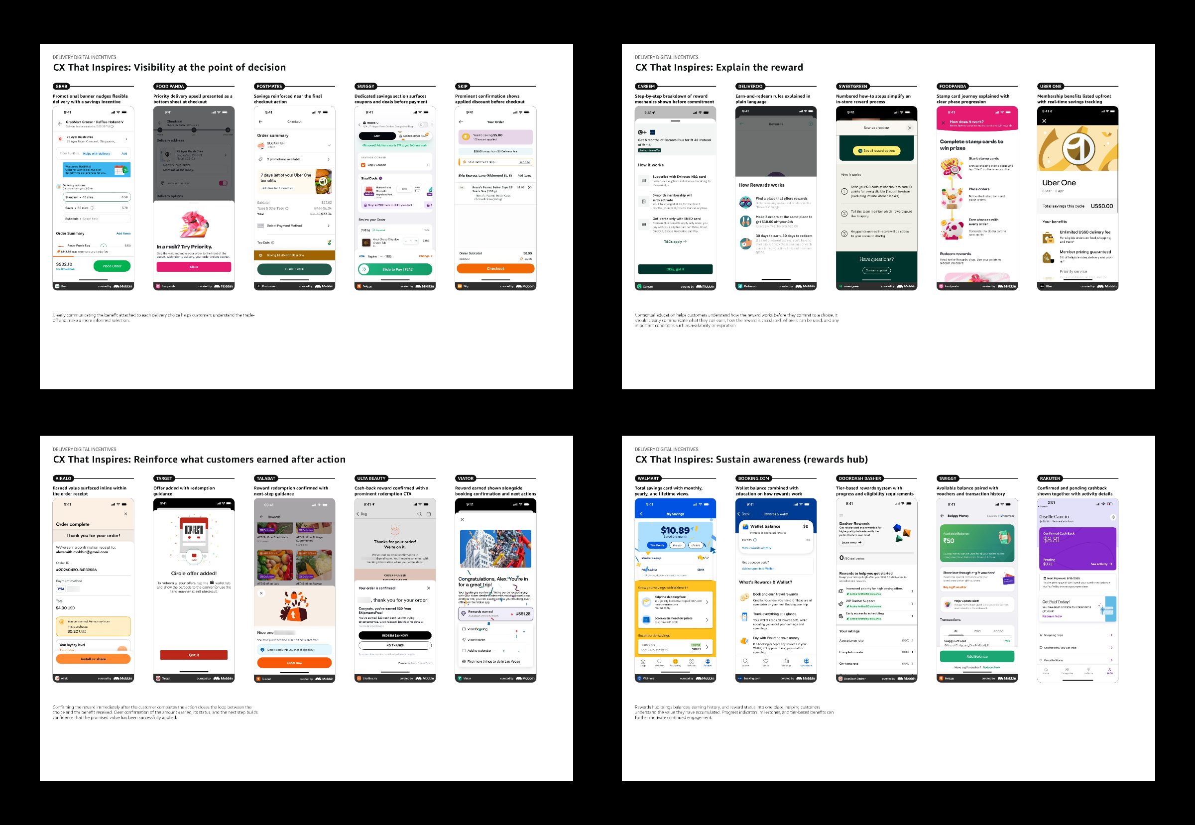
A sample of the benchmark: how comparable products handle visibility, explanation, confirmation, and reward hubs.
The problems in the current experience.
Three key problems.
- 01The offer isn't visible to customers: it's easy to miss at checkout.
- 02Information about the delivery program itself is fragmented, spread across disconnected pages rather than one clear place.
- 03There's no confirmation if a customer opts for a slower delivery, no indication they've earned a digital reward.
The Delivery Experience Team (DEX) owns three jobs in that chain: making customers aware of the reward their delivery choice earns, telling them where they can use it, and assuring them that they've earned it. I owned the design strategy and the case for change across it.
In Q4 2025, we tested a more prominent treatment on the checkout page to make the offer clear and hard to miss. It worked: credit acceptance rose by up to 50%. But it had problems: it was a new component that didn't match the shopping design system, it added about 1.5 seconds of page latency, and it wasn't interactive: a static banner, so it was difficult to establish the connection between the banner and the delivery options below it. This experience was scaled back within 4 weeks.
Beyond that one experiment, two other problems remained: comprehension and confirmation.
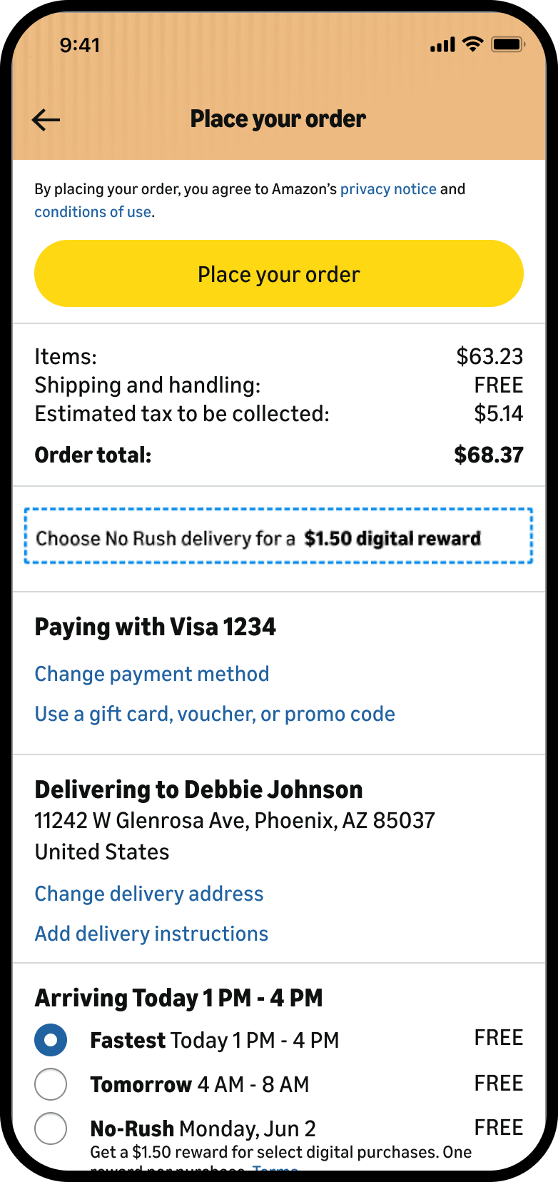
The No-Rush banner in the checkout page, tested in Q4 2025.
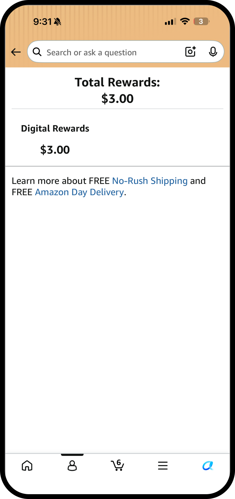
Stand-alone page that appears when customers tap on “Terms” under the No-Rush delivery option in the checkout page.
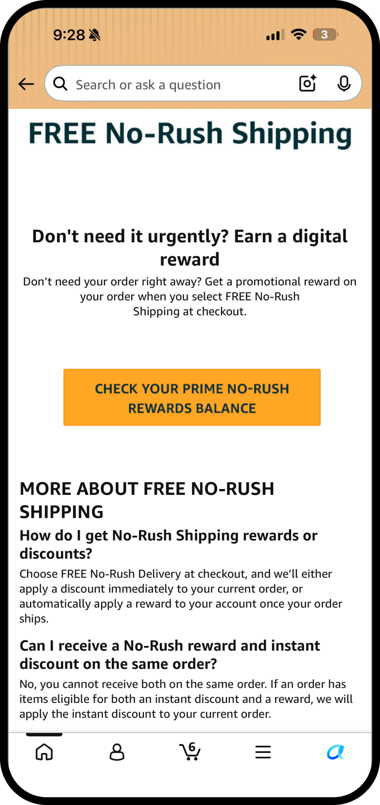
From the previous standalone page, when a customer taps on "No-Rush Shipping", they land here. The experience is fragmented.
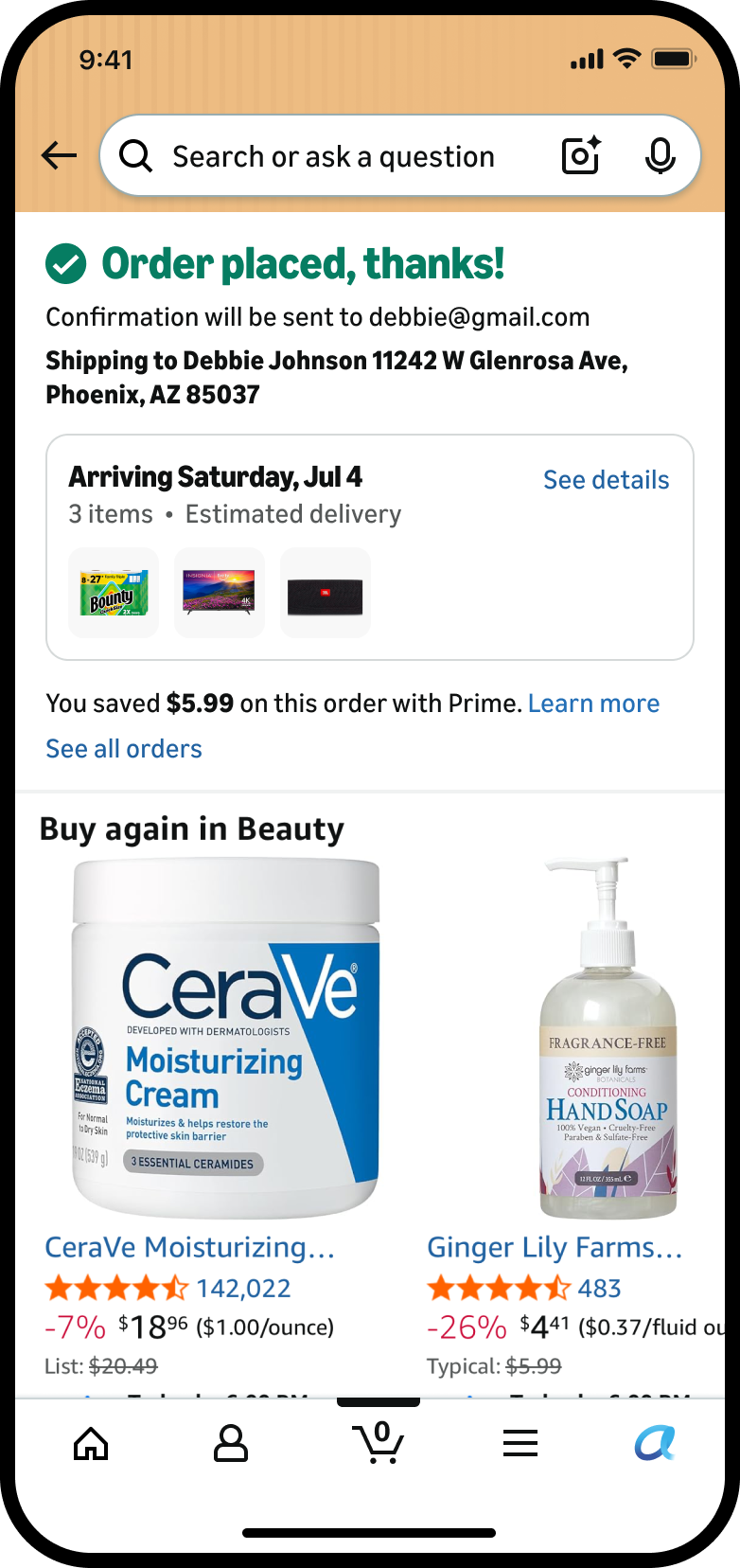
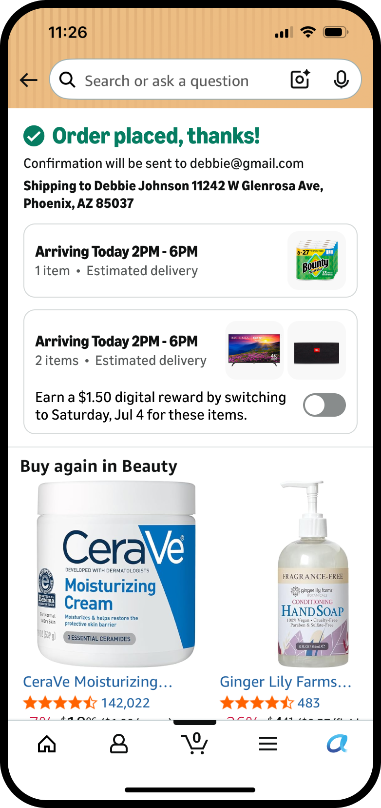
The customer opted for No-Rush delivery, but on the order confirmation page there's no acknowledgement at all that a reward was earned.
Turning a stalled program into a funded bet.
No one owned this program, so there was no playbook. I built one as I went: evidence first, prototypes to make it real, and alignment to make it stick.
Ship a pragmatic fix, and prototype the bigger vision.
I worked across two horizons: near-term solutions to fix the current problem and increase adoption, and moves toward the North Star vision for digital rewards.
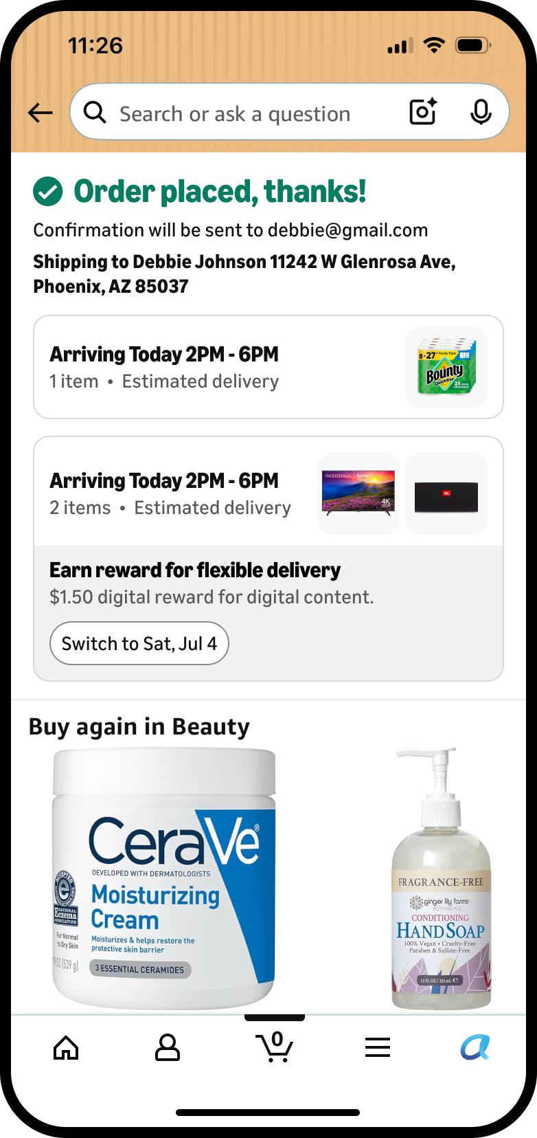
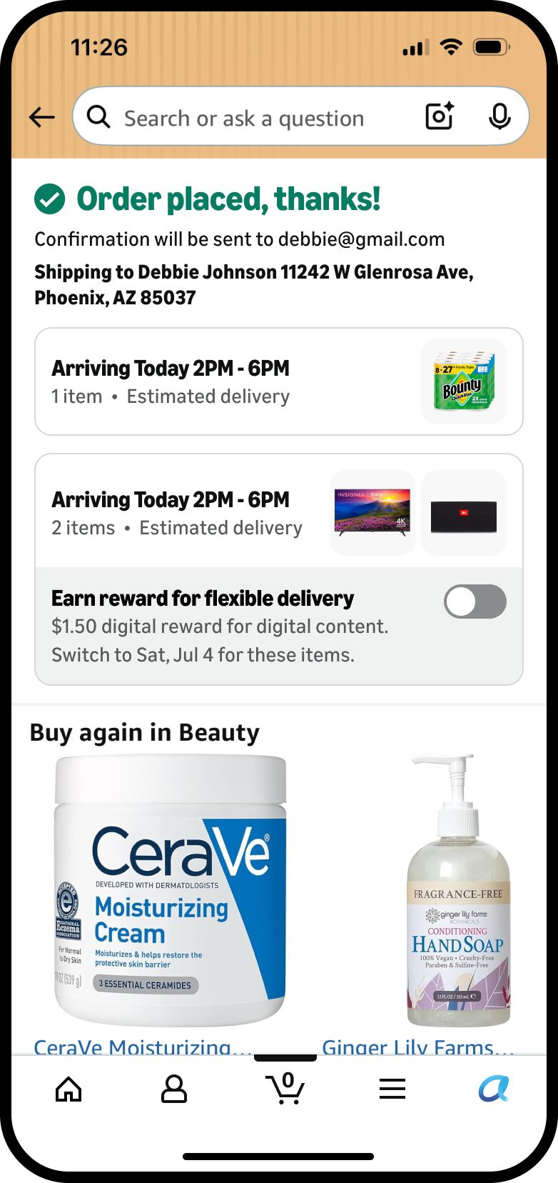
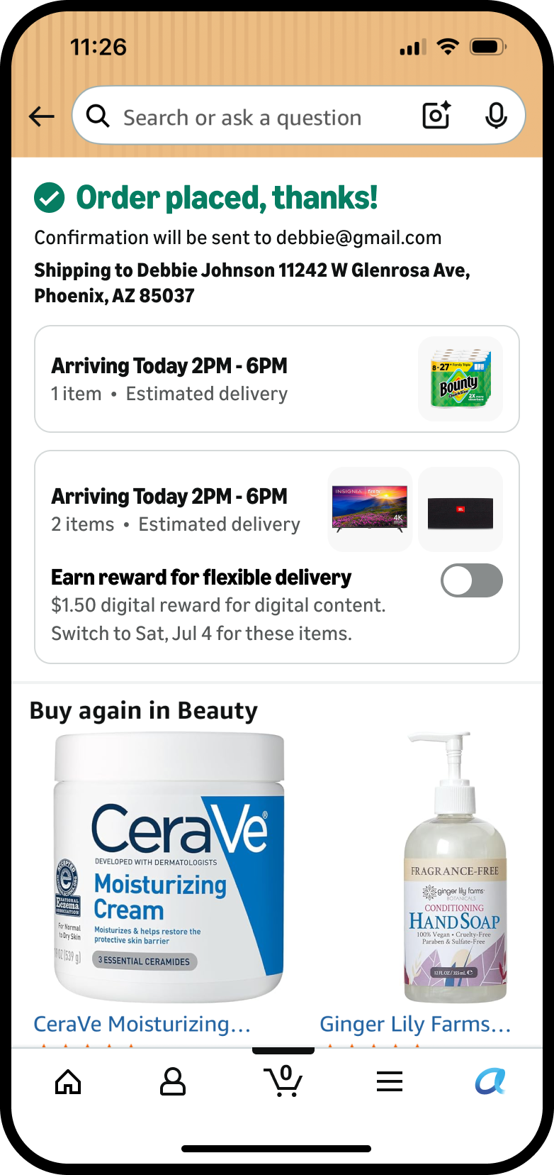
I partnered with cross-functional stakeholders to identify the latest patterns for showing promotions and coupons, then designed a smaller, lighter, promotion-style placement that makes the offer actionable.
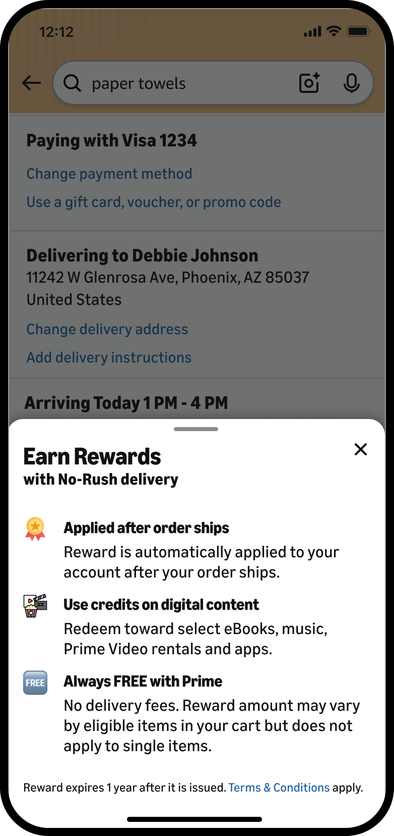
Second, instead of sending customers to separate standalone pages, I designed an in-the-moment bottom sheet: when a customer taps into the digital rewards offer at checkout, it opens right there with information about the rewards program.
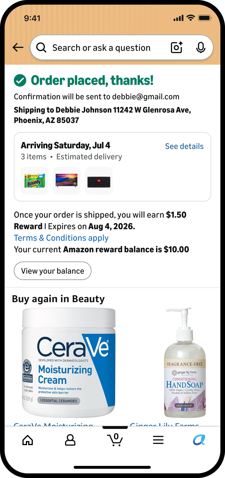
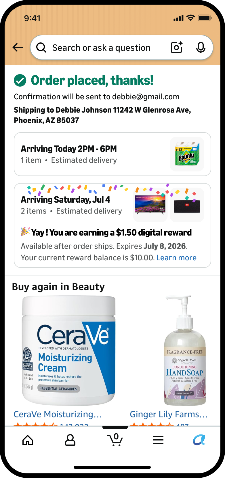
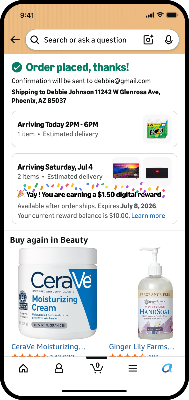
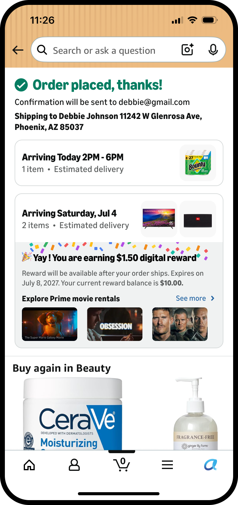
Third, a confirmation moment: when a customer opts for No-Rush, they get a clear confirmation that the reward will be available once the order ships.
- “Why should I opt for a slower delivery?”
- “What even is this reward, and why are there so many pages?”
- “Okay, I chose slower delivery… so where's my reward?”
- 1Say plainly what they get: a real reward for waiting, not a vague discount.
- 2Collapse the reward into one clear offer at the moment of choice, no separate pages to hunt through.
- 3Confirm the reward the instant they opt in, and give them a clear way into the rewards page.
One framework, two surfaces.
Checkout banner
Hypothesis: showing the reward at the moment of choice drives engagement. Control against four banner treatments, each changing one variable.
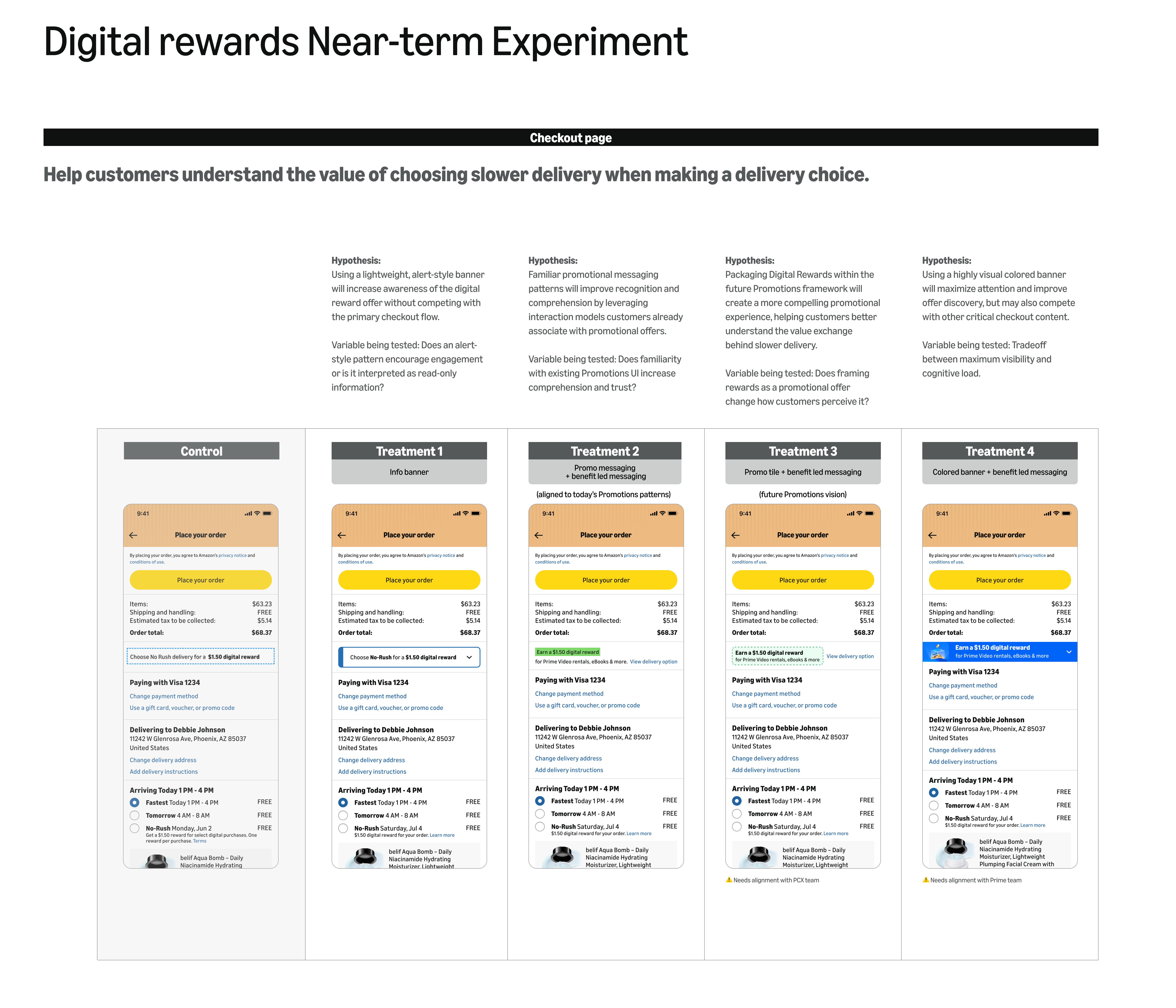
What I took forward I locked Treatment 1 and Treatment 2 as the direction, dialling up in Q3 2026. Treatment 2 was the lead call: it follows Amazon's current Promotions guidelines, so it's a low tech-lift bet, while the promo-tile and colored-banner arms were more forward-looking vision work.
In-the-moment bottom sheet
Hypothesis: reward information in context, with clear hierarchy, improves comprehension, both how the program works and what customers earn. Control against six sheet treatments.
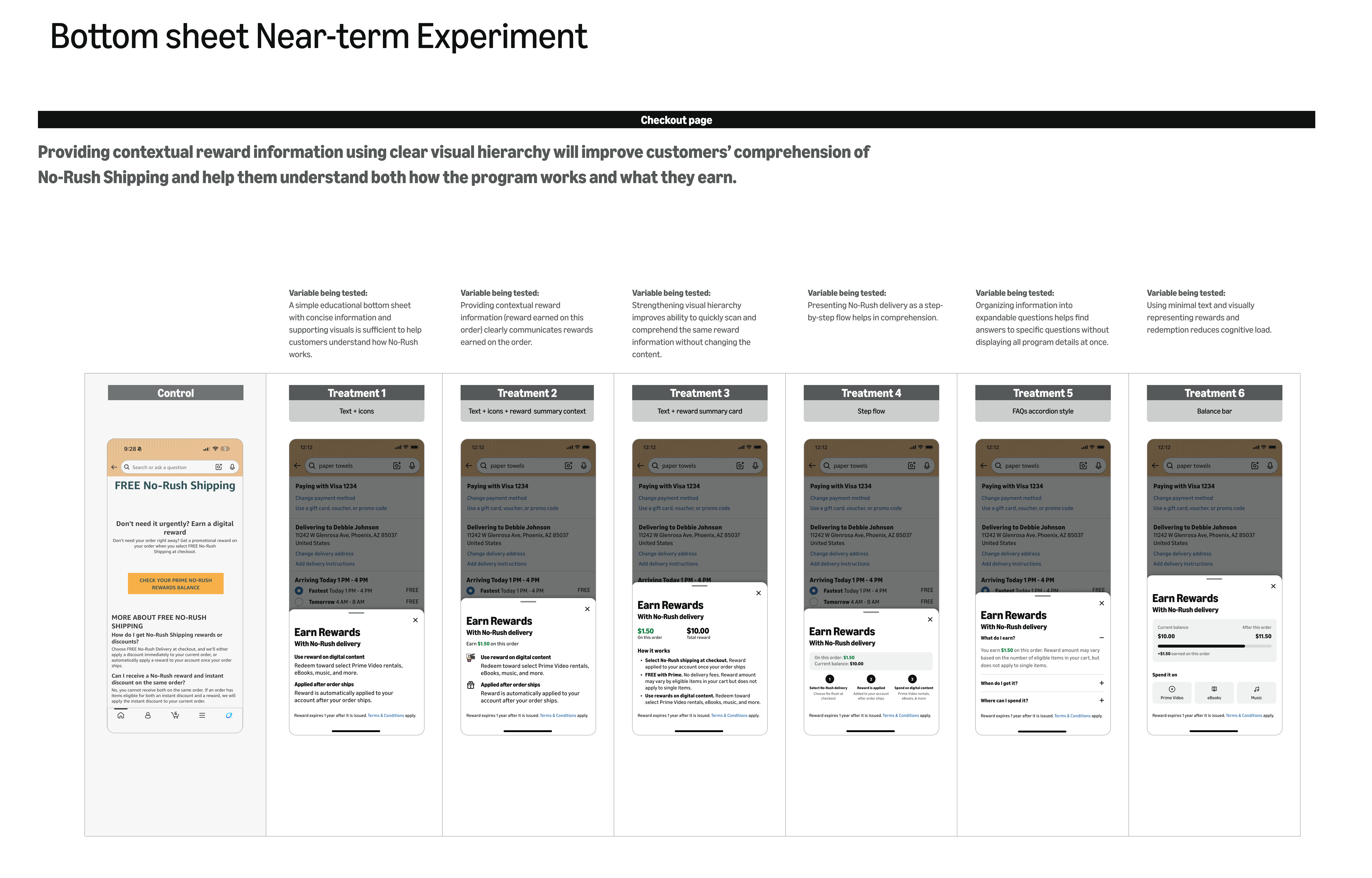
What I took forward I locked Treatment 1 and Treatment 2 as the direction, dialling up in Q3 2026. Treatment 2 depends on plumbing reward data from partner teams (the running “you currently have $X” balance), so it's the higher tech-lift arm.
Three surfaces, one loop.
Locked with partner teams and dialling up in Q3 2026, across the purchase and post-purchase surfaces.
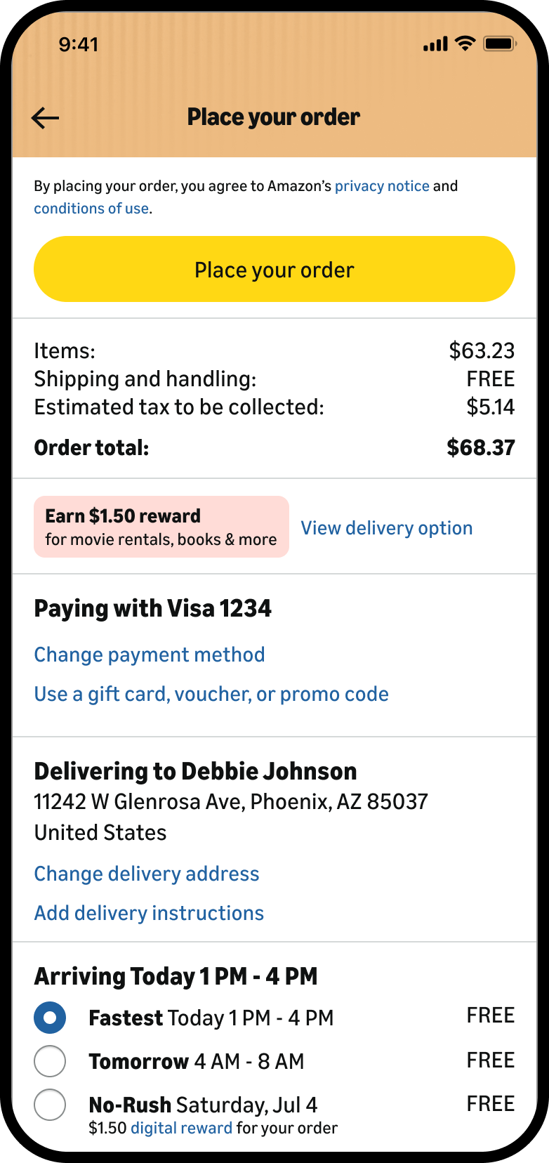
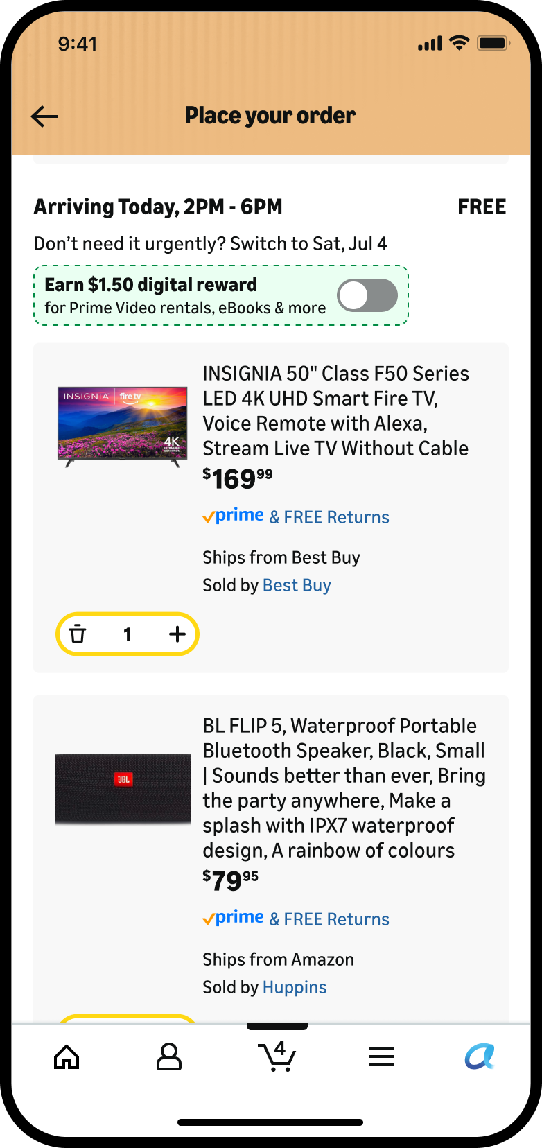
Reward line at checkout
A promotion-style line at the moment of choice. It names the amount, what it's good for, and links straight to the No-Rush option instead of a separate page.
The explanation, in context
The full detail without leaving checkout. The reward on this order leads, and the old long-form page collapses into two lines: where it can be spent, and how it adds to the balance.
Confirmation that closes the loop
The part the old flow never had: what they earned, when it lands, when it expires, and the balance it adds to, on the page where they'd otherwise wonder.
Where we're headed next.
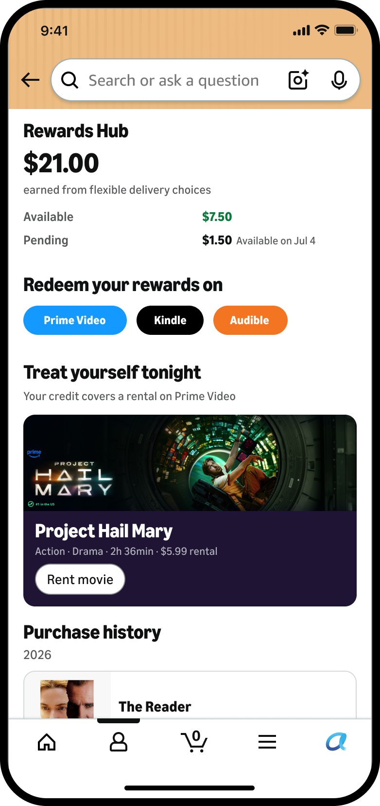
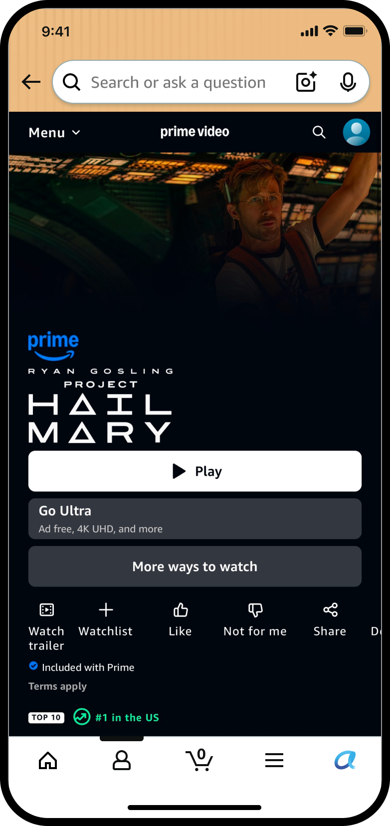
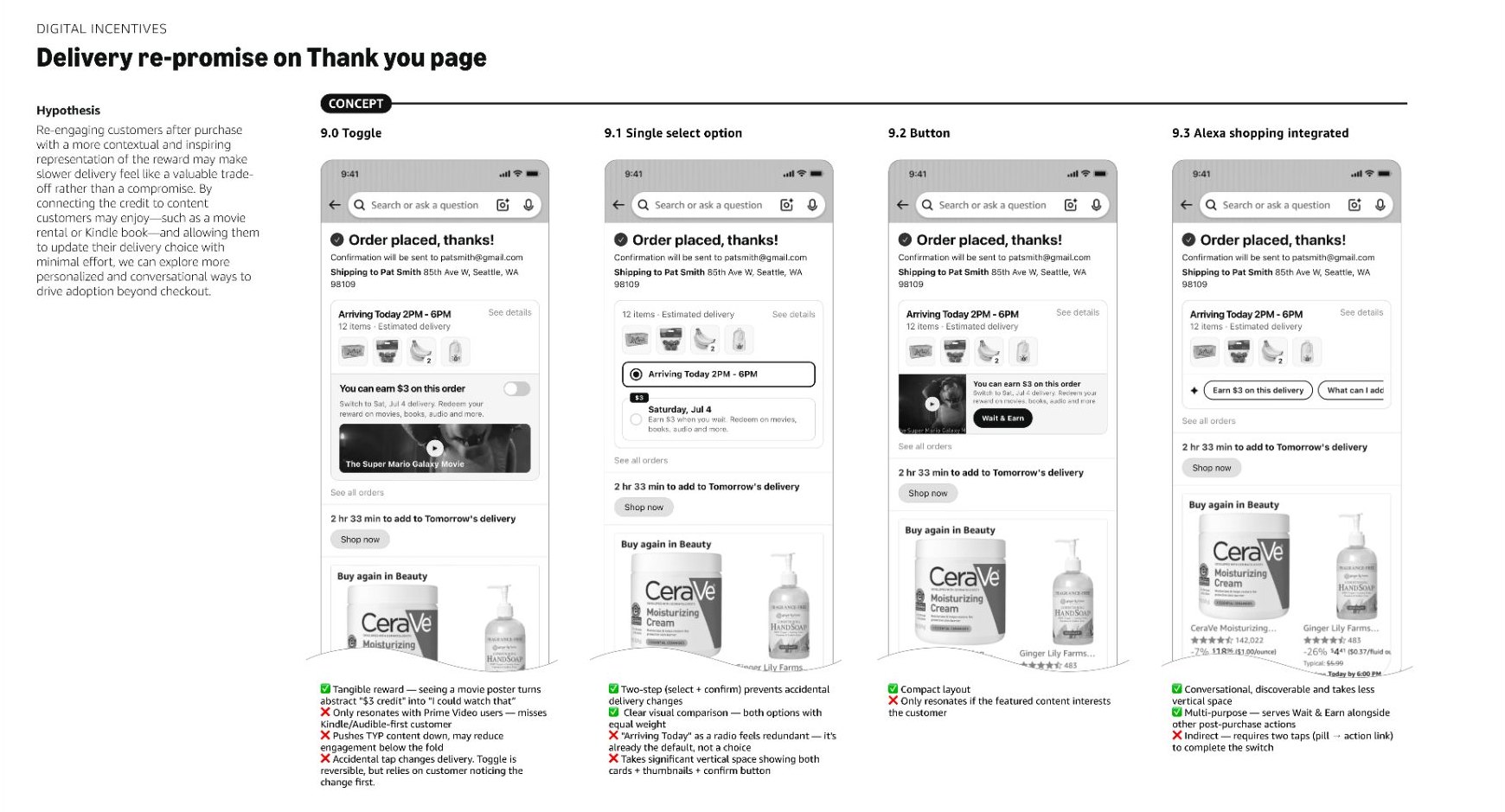
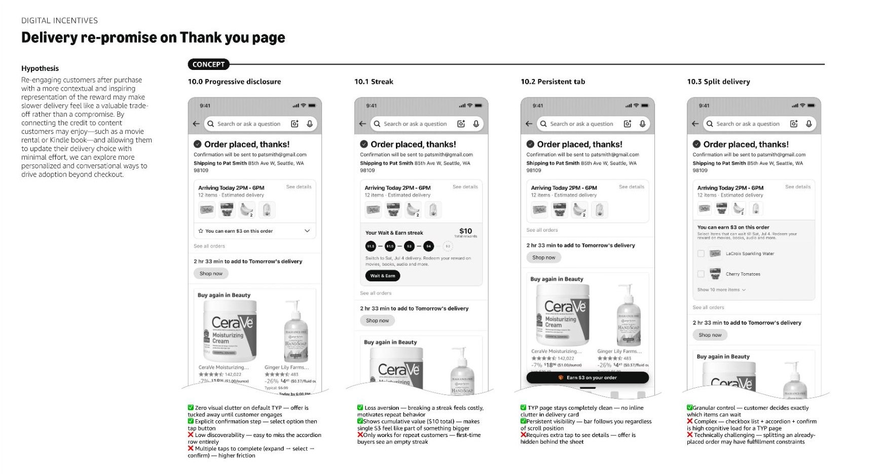
A few bets that look beyond the near-term fixes, at the entire reward journey.
First, an in-context nudge: embed the reward within the delivery options on the checkout page, where the customer is actually choosing, instead of a banner bolted to the top of the page.
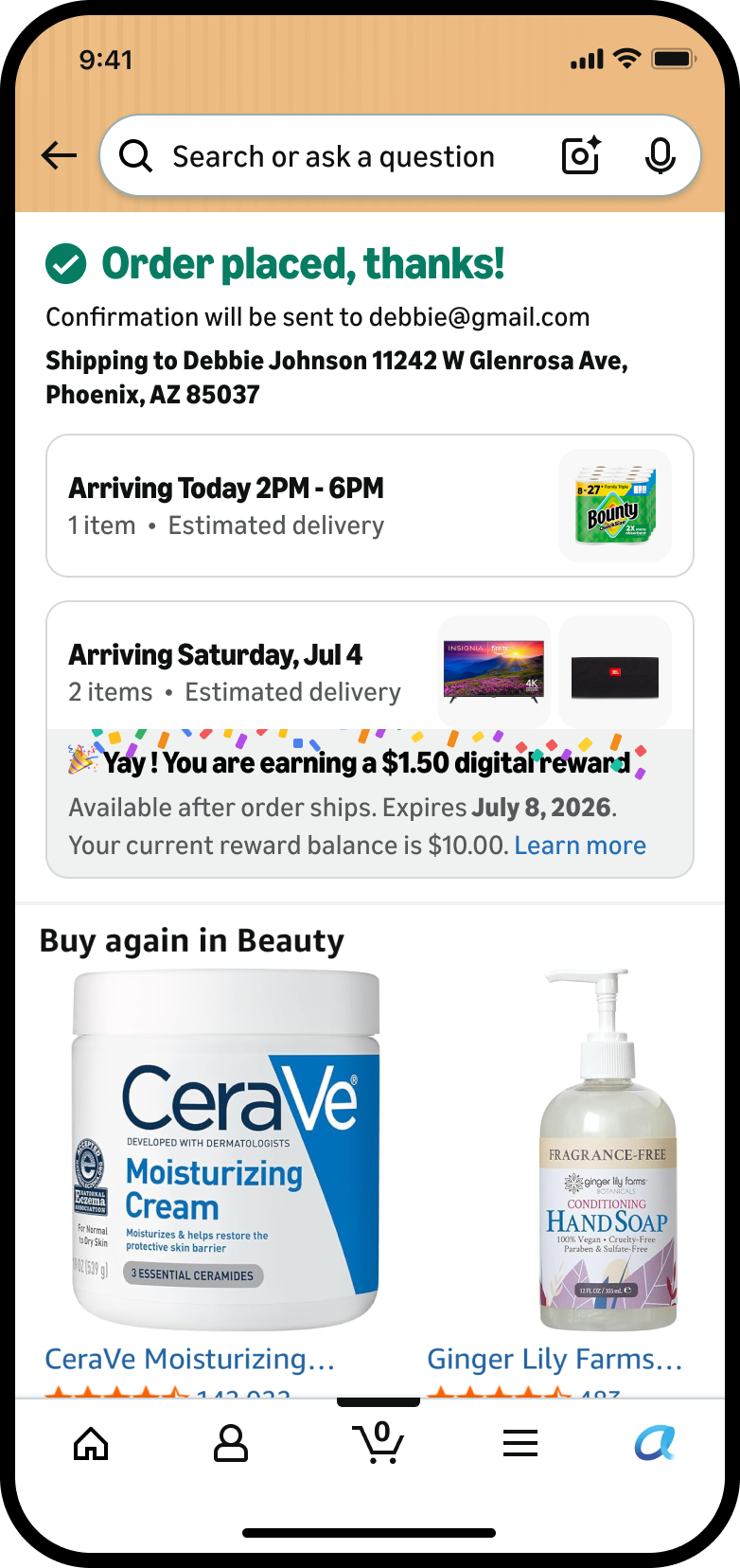
Second, more celebratory CX: a leadership ask to make opting into a slower delivery feel rewarding, not transactional, so customers are encouraged to choose it whenever they can.
Third, re-engagement: for a customer who didn't opt into No-Rush, a second chance afterward, on the Thank-you page, while there's still time to switch to a slower delivery and earn a reward.
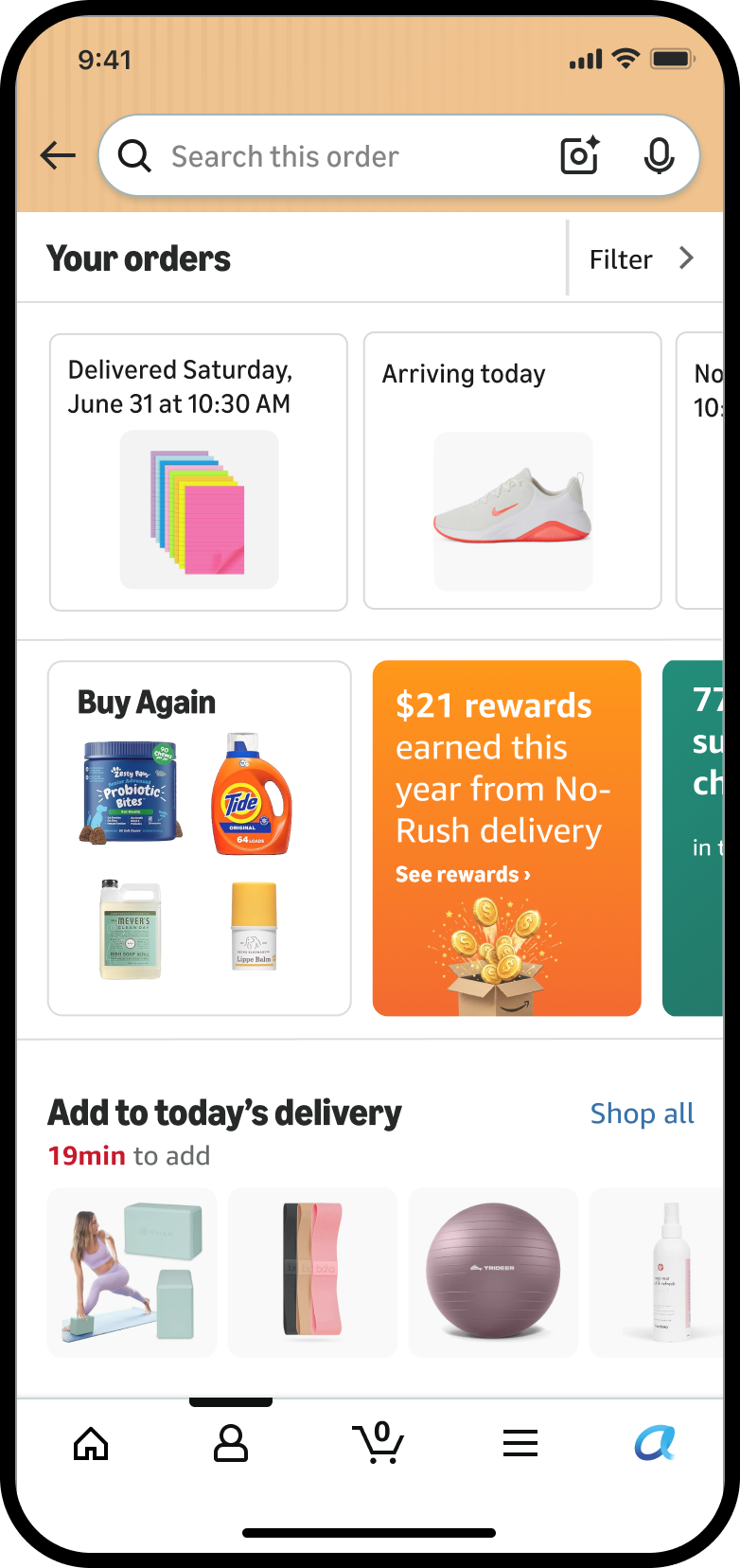
Fourth, a rewards hub: today, customers don't know how much reward they have until they're at the point of redemption. One place to see rewards earned, past redemptions, and where to use them, closing the gap between earning and redeeming.
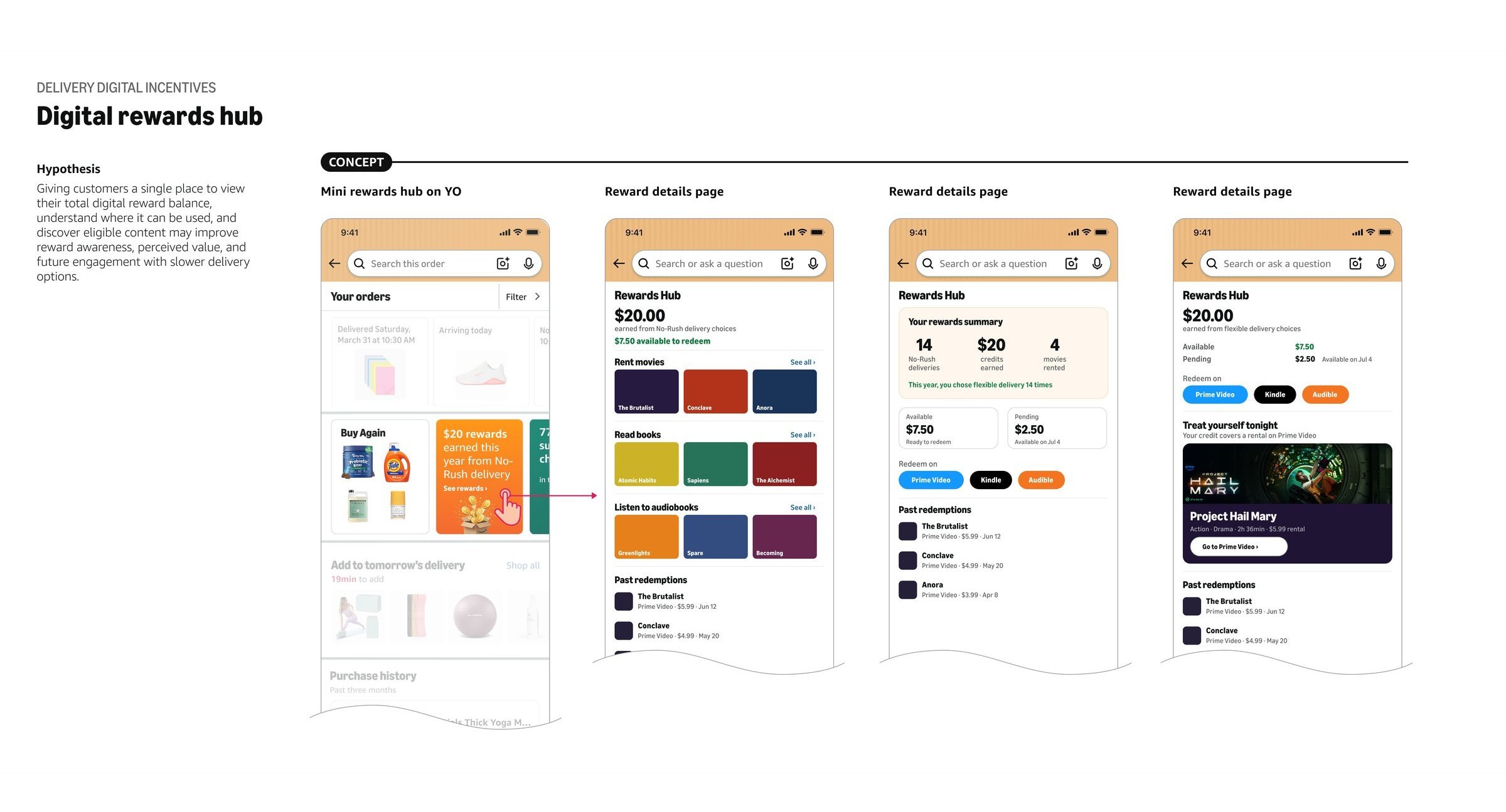
Making the case for a bigger investment across several teams.
The most important output was a clear, shared case for the opportunity, one that unlocked multi-year funding across three orgs and is now part of the roadmap.
Pairing a credible near-term fix with a prototyped vision moved the discussion from a single underperforming test to a multi-year opportunity worth investing in.
This was the biggest piece of the work: building the strategic narrative for why the program mattered beyond shipping savings, and getting leadership across Prime Video, Digital Acceleration, and Delivery aligned enough to fund it. That reframe is now reflected in a shared roadmap and a cross-team effort to measure the program's full, Amazon-wide value.
Where AI made the real difference was validating fidelity, interaction, and feasibility on the fly, freeing my time for where it mattered most: influencing leadership, documentation, strategy, and system-level alignment.
This project is in flight. Specifics are kept directional, and figures are intentionally omitted.
In flight, with next steps sequenced.
What I pushed for, and what I let wait.